So you’ve found a piece of art you love — but now you ask yourself the age-old questions: Should I frame my artwork? And what frame works best with my artwork and space?
Don’t worry, I’ve got you covered.
I’ve done the research for you so you can decide with confidence if you want to frame your art or go with a frameless float instead. I’ve talked to interior designers, framers, artists and art collectors. I’ve read dozens of articles on the internet. And I’ve tapped into countless conversations in my West Seattle art gallery and years of my own experience helping people like you curate a calming space that welcomes and inspires.
It all culminated in this guide.
I wrote it to put an end to that feeling of analysis paralysis you are probably feeling right now. You’ve finally chosen from a wide variety of artworks. And now you’re supposed to figure out if a frame is necessary, too, and if so, which one is the right one? Who has time for that? Not you. You’re busy. I’ve seen it all too often… The result? You put it off. And then? That empty wall continues to stare you in the face and elevates your stress levels rather than your mood.
It’s time to do something about it. After all, the hard part is already done: Out of a sea of tens of thousands of artworks, you’ve found one (or a few) pieces that you love and no longer want to live without. That’s huge! And now, thanks to this guide, you’ll have an answer to the question “Should I frame my art?” in no time.
So let’s dive in and answer the five most common questions that collectors like you ask when choosing whether or not to frame their artwork. As you do, remember that I am always available for a complimentary in-home or online art consultation if you need a little more help (book here).

What frames do I use for my art?
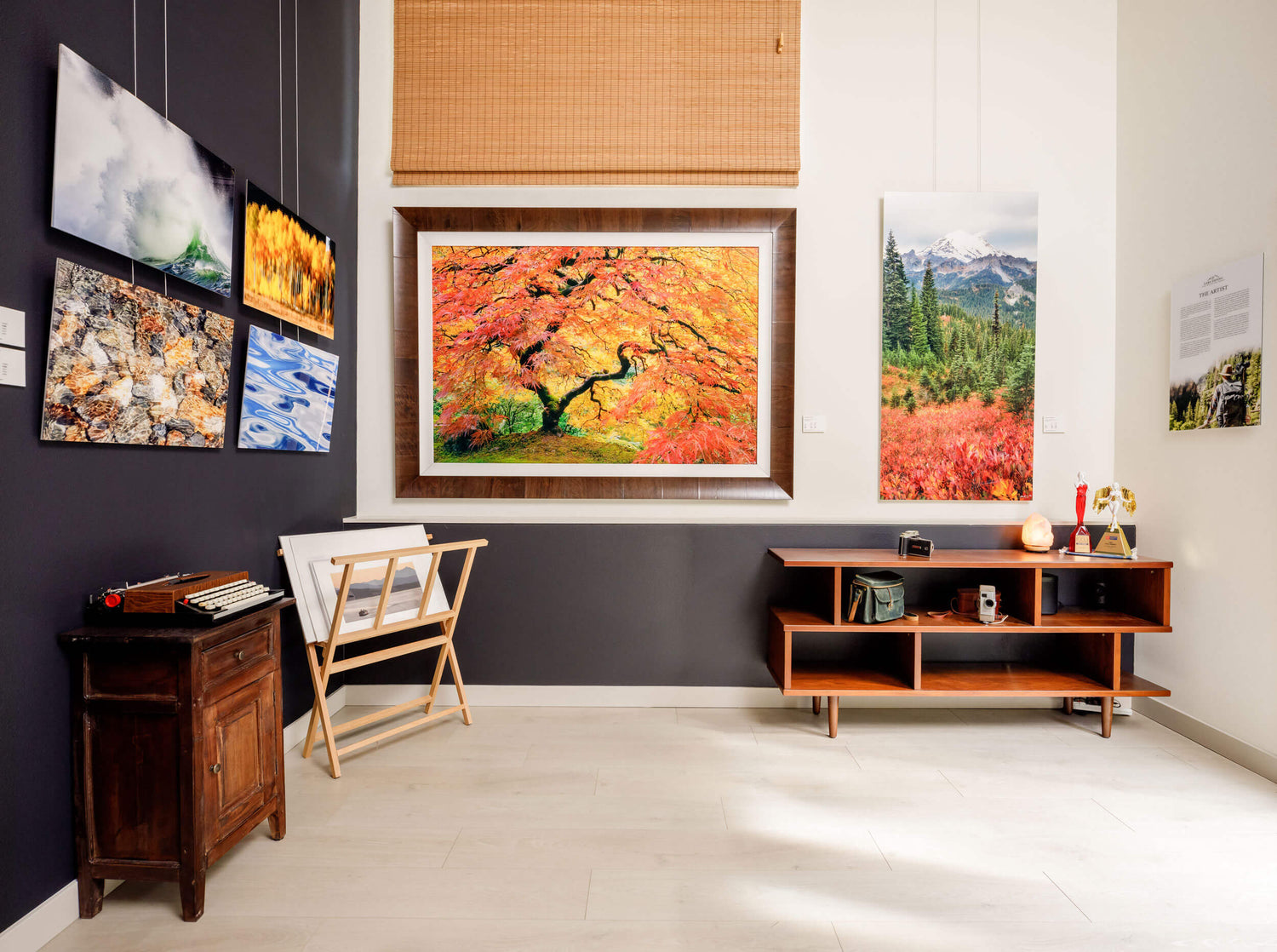
Each of my frames is handcrafted by Italian artisans using rare olive wood. Inspired by the rolling hills of Tuscany, these craftsman frames are the perfect representation of my overall goal: To help you curate a calming space that welcomes and inspires, a space that encourages a simple and naturalist way of life without sacrificing sophistication.
Each frame strikes a careful balance between rustic and contemporary styles, showcasing the unique grain, distinct textural patterns and durability that olive wood is world-renowned for. “These frames are perfect for Pacific Northwest homes,” interior designer Paula Kennedy told me when she first walked into my West Seattle art gallery. “They are transitional — not too contemporary, not too traditional. They are neutral, style-wise, and they fit most spaces. They are timeless.”
In addition to its lightweight yet durable qualities that ensure your frame will stand the test of time, olive wood for centuries has been a deep source of spiritual inspiration. Drawing on our well-established spiritual connection to trees, the olive tree is often called the Peace Tree. That alone makes it the perfect compliment for your nature-inspired artwork that will turn any space into a calming sanctuary.

What are the advantages of framing your art?
There are a lot of good reasons why you might want to frame your artwork. Here are five of them.
WOOD ADDS WARMTH AND HELPS YOU STRIKE A CALMING BALANCE IN YOUR SPACE.
With its earthy tones, wood elements add warmth to any space — and to any artwork that might otherwise lack some of that warmth. Take, for example, artworks that predominantly feature cooler tones such as white — like my winter images FAMILY BONDS and ECHO: They were created to spark that feeling of inner coziness that winter days can evoke in each of us — and a warmly-colored wood frame will help accentuate that feeling, while also counterbalancing the predominant white tones in the artwork.
Combining the contemporary feel of fresh white with rustic wood accents creates the perfect transitional style. Remember, using color theory in interior design to create comfortable and well-balanced spaces is all about contrast (more on that in one of the sections below).
WOOD FRAMES CAN CONNECT THE ART TO YOUR ROOM.
Did you fall in love with one of my artworks but you are concerned that it might not match your home’s style? Here is your solution: Choose a frame that connects the art to your room — maybe because it matches the hues of your wood furniture or floors, or simply the overall style and aesthetic.
FRAMES HELP KEEP THE EYE WHERE YOU WANT IT — ON THE ARTWORK.
If your artwork of choice is really “busy” and has a lot of different elements that the eye jumps to, a frame might be helpful to keep the eye on the artwork longer. A good artist’s rule of thumb to remember is that you want to keep the eye in the center of the artwork for as long as possible since the closer the eye gets to the edge of the art, the more likely it is that it will use that as an excuse to exit. You spend good money on your artwork, so you want the eye to effortlessly stay on it, don’t you? A frame will help with that.
This is particularly true if you plan on hanging the artwork on a wall where other artworks, shelves, light fixtures etc. compete with it and can easily “distract” the eye. If, on the other hand, the artwork is the only thing that will grace that particular wall, a frame becomes less important, even if the artwork is busy, since there are fewer things around that the eye might get distracted by.

A FRAME MAKES THE ART EVEN MORE OF A FOCAL POINT.
This thought expands on what I just talked about — a frame helps guide and contain the eye to areas where you want it. Chances are, your artwork will be the focal point of the room (in fact, that’s one of the advantages of using large-sized artworks). “Any space we walk in, we find what's a comfortable path to carve our way through congested areas,” says West Seattle interior designer Andrea Bushdorf. If the eye can use artwork as a comfortable landing spot, a space will immediately feel more balanced and less stressful — and putting a frame around the artwork can make it even easier for the eye to softly land here.
WOOD FRAMES HAVE CALMING QUALITIES.
If you are trying to create a space that feels like a sanctuary for your busy mind, wood is your friend. In fact, studies have shown that the presence of wood has a stress-reducing effect, writes Sally Coulthard in her book Biophilia — You + Nature + Home (more on the art of Biophilic interior design here). “Environments that use wood as an explicit part of their design have been shown to actually lower blood pressure and decrease pulse rate. In some instances, where an interior is almost entirely wood (covering 90 percent of the room), there is such a calming effect that the experiment concluded that it would be too relaxing for a work space (but perfect for a spa).”
Yet researchers also found that people working in a room with lots of wooden furniture and surfaces — maybe just not quite 90 percent of the space — experienced less tension and fatigue. Why is that? A big part of the reason, Coulthard writes, “is that touching and seeing timber gives people a reassuring feeling of being close to nature.”
West Seattle interior designer Paula Kennedy couldn’t agree more. “Our home is a beautiful place to not only physically but also emotionally connect with nature and the earth,” she says. “And wood is a very grounding material.”

What are the advantages of choosing a frameless float instead?
Okay, so there are plenty of reasons why you might want to frame your artwork. But: With all that being said, 80-90 percent of my collectors still choose the frameless float option instead. Why? There are very good reasons to skip the frame, as well. Here are the top three. Maybe you find this applies to your space, taste and budget as well?
FRAMELESS FLOATS ARE MORE CONTEMPORARY AND VERSATILE
My frameless acrylic floats have a recessed mount installed on the back that lends them a more modern, contemporary feel as the art “floats” on the wall. This process also makes your artwork more versatile. All that talk above about matching the wood frame to your space? If you don’t know yet where exactly you’ll hang the piece, or if you think you might move it around, or making sure the frame matches is simply something you rather not have to think about — the frameless float option matches most interiors much more effortlessly.
SAVE MONEY ON THE FRAME AND INVEST IT IN BIGGER ARTWORK
I’m not breaking any news here: Framing art isn’t cheap. Granted, my production facility will usually charge only about a third of what your local frame shop might charge. But a quality, handmade frame will (and, quite frankly, should) always be a big investment. It’s at least worth considering avoiding the price tag for the frame and investing the saved money in a bigger artwork instead.

NOT FRAMING ART GIVES IT ROOM TO BREATHE
As I wrote above, a frame is a great way to contain the eye in a busy scene. But that automatically comes with a downside, too: A frame contains the eye. What if you want the eye to wander, to let it get lost? Well, if your artwork doesn’t compete with a lot of other elements on your wall that could draw the eye away from it, then going with a frameless float will give the art more room to breathe and really drive home the impression of open space. This works particularly well when the artwork itself has fewer elements in it and is more simplistic.
My collector Mike put it a different way when we talked about whether he wanted to collect my image FAMILY BONDS framed or unframed. “Bison are meant to roam freely,” he said — and that’s why he skipped the frame.
One word of caution if you do decide to go with a frameless float: When you choose to hang your art without a frame, it is easy for the floating artwork to get lost on a wall if you don’t buy it big enough (walls are bigger than you think). Concerned? Don’t worry — my complimentary mockup service has you covered and will help you confidently choose the right size artwork for your space in minutes.
Does a frame need to match your decor?
So you’ve weighed the pros and cons of framing your artwork, and you’ve decided that you want to add one… Now the question probably is: which frame is best for my artwork and my home?
At the core of that question is the great debate whether a frame needs to match your decor or not. As with the decision to choose a frame in the first place, there really isn’t a right or wrong answer. It comes down to your personal taste, space and budget (I know.… the lack of clarity can be frustrating. Look at this article more as a guide than a rulebook).
That being said, I’ve talked to a variety of interior designers, artists and framers about the question whether a frame needs to match your decor and how to seamlessly blend different wood styles, and there are three different takes that I’ve heard over and over again. My two cents: Consider all three pieces of advice, and then choose which one best mirrors your design philosophy and personality. No need to overthink this.
ADVICE #1: STAY IN THE SAME COLOR FAMILY
Chances are, before you ever chose artwork for your space, you chose floors and furniture and other finishings. Now that it is time to pick a frame that brings out the best in your new artwork and fits into the cohesive design of your room, West Seattle interior designer Paula Kennedy advises to keep the hues of the woods you use in your space in the same color family. “I’m not going from a red undertone to a blue undertone,” she says.
ADVICE #2: FEELING ECLECTIC? DON'T BE AFRAID TO MIX & MATCH!
Paula’s fellow West Seattle interior designer Andrea Bushdorf claims a bit more freedom — but ultimately arrives at a similar conclusion. “There is a mindset that all of our woods have to match. I think the person who feels that way is the same person who wants their sofa and club chairs to match because they need that continuity, or they think they need that continuity,” Andrea says. “I don't feel that way. I feel we can mix and match wood tones and finishes. I'm wearing gold and silver jewelry — I do it all the time. And we can do the same in our home.”
At the same, she says, if you have a lot of wood in your home, say you have a strong rustic theme with a big rustic fireplace and barnwood floors, “then I would say: Yeah, we need to take that into consideration, especially when we're talking about a large piece of art.” “But if you have a wood table, and maybe some wood legs on a couple of the furnishings, those elements likely already don’t match. You probably don't even realize it. And I think that's a less of a concern.”
Ultimately, Andrea says, choosing the right artwork frame that fits into your existing decor is less about finding exactly matching woods and more about finding a balance between warm versus cool tones.
ADVICE #3: FRAMES SHOULD COMPLEMENT THE ARTWORK
Here is the honest truth: If you ask interior designers about artwork frames, their primary goal (and job description) is to match the frame to your space. If you talk to artists and framers about choosing frames, they will likely tell you the frame first and foremost needs to match the artwork.
That’s certainly what my former framer Jeff in Denver used to tell me. He was adamant that people should not worry about a frame matching their decor. He wanted to use frames that would complement the artwork. What did he mean by that? Either the frame would mirror a color present in the artwork, or its grain and texture would play off something present in the artwork — or the wood used to make the frame would extend the meaning of the art and tie into its story.
WHERE DOES THAT LEAVE YOU?
My job with writing guides like this one is to give you the best information out there so that you can make a good decision about what’s best for your space, taste, and budget. I say that to take the pressure off of you. Don’t feel like you need to follow each piece of advice here to the T. You don’t. Listen to what professionals suggest, and then adopt it to your own preferences and personality.
In the meantime, rest assured that based on my years of experience helping collectors find the perfect art (and frames) for their space, the different earthy hues of brown represented in my current curation of frames are a variety of deeply grounding, neutral colors that are meant to be both versatile and cozy in any space — including yours.
Ultimately, it may have been Justin Tollefson, principal architect at Pearson Design Group, who said it best in a recent Mountain Living article: “Wood should have an attitude about it — let it establish the mood. Paying attention to this can reinforce a style, or provide interest by contrasting with the surrounding style of a space.” The choice is yours — have fun with it.

What are the best (wall) colors that go with brown wood frames?
If you are currently remodeling your home, or choosing new artwork is part of a larger effort to rethink how your room feels, you might want to consider how different (wall) colors interact differently with the wooden finishes in your space, including artwork frames.
It all comes down to the fascinating field of color psychology in interior design.
My available frames all feature different hues of brown — for good reason. “Brown is a color firmly rooted in nature. It is reliable and timeless,” says Suzanne Duin, founder of Maison Maison, in this Homes and Gardens article. “It is a warmer and more contemporary alternative to a gray canvas, and it is suitable for pairing with just about any color.”
CONTRAST IS KING
So what colors go well with different hues of brown? The first thing to keep in mind is that contrast is key in creating visually stimulating, well-balanced rooms. The bigger the contrast, the bigger and more dramatic the impact. The contrasting color to brown is blue — a deep blue wall will pull out the warm hues in the wood frame you choose. It’s the reason why I painted the dominant wall in my gallery in a deep blue.
Don’t want a dark blue accent wall? The idea of contrast also works the other way, if you want a light and airy space with lots of white and beiges. In that case, the wood frame becomes the warm contrast to the cooler shades of white and will serve as a focal point in a contemporary space.
LEAN ON THE GROUNDING COLORS OF NATURE FOR CALMING SPACES
Blue and brown are both calming colors grounded in nature. For even more of a sanctuary feel, complement a wood frame with green accents, for example indoor plants (they have the added bonus of also naturally purifying the air in your space!).
Benjamin Moore’s color expert Helen Shaw says in Homes and Gardens, “Green works particularly well as an accent color for brown as both tones are reminiscent of nature, which will help to create a welcoming and nourishing energy. When colors occur naturally together in the environment, they are inevitably going to complement each other.”

THE 60-30-10 RULE AND CHOOSING A FRAME
A rule of thumb that interior designers swear by when they come up with pleasing color palettes for a well-balanced, welcoming space is the 60-30-10 rule. It’s pretty simple: Every space should have a dominant color that makes up about 60 percent of the room. Chances are, that hue will be the primary color you choose for your walls.
You’ll complement that color with the secondary color that should make up about 30 percent of the space. That color will likely show up in feature walls, floors and trims, curtains and furniture.
Last but not least is the accent color, which ideally makes up about 10 percent of the room’s overall color scheme. A great place for that accent color to show up is in artwork — it’s the “pop of color” so many of my collectors cite as the reason for bringing one of my pieces into their space. Accent colors can also be represented in decorative items such as cushions or lamps.
How does the 60-3-10 rule apply to choosing a frame for your artwork? Well… think about the dominant colors in your space, and see where the hue of the frame might fit in. Does it match the secondary color of your space? Or is the frame maybe the prominent tertiary accent color in an otherwise more monochromatic, contemporary space that mostly features soft, neutral colors?
Keep in mind that each color can be represented in different hues or “shades” — so there is quite a bit of leeway in choosing three colors to fit within the 60-30-10 rule. Don’t beat yourself up.
How to choose between unframed floats and framed artworks
As you’ve probably figured out by now, there are good reasons to frame your artwork — and there are good reasons to go with a frameless float instead. My hope is that this guide gave you the tools to confidently decide what works best for your unique space, taste, and budget.
As you make that decision, I want to make sure you don’t lose sight of this inevitable truth: Naked walls are a massive squandered opportunity — so don’t continue to put off the decision until later (we all know how that ends). Keep in mind: The right art will turn cold, uninviting spaces devoid of character into home-y sanctuaries that celebrate your unique style, personality and memories.
So… if you are still not sure whether a frame is right for your artwork, know that I am here for you! Book your free in-home or online art consultation today, and let me help you find the artwork (and frame?) that will help you curate a calming space that welcomes and inspires. Don’t let those empty walls continue to stare you in the face!
ABOUT THIS BLOG
Leave a comment